Cascade Bicycle Club Redesign
Overview
In this 3-month project, I worked on creating a new website design for the Cascade Bicycle Club, including redesigning IA, user flows, page templates, content strategy and visual guidelines.
Client: Cascade Bicycle Club is the nation’s largest statewide bicycle nonprofit based in Seattle. They offer programs and rides for all age and diversity groups to teach the joys of bicycling, advocate for safe places to ride, and produce world-class rides and events.
+ My Role | Research, UX & UI Design, Prototyping
+ Methods | Interview, Persona, Usability Testing, Wireframe, Information Architecture, Content Strategy, and Visual Design
+ Tools | Figma, Marvel, Optimal Workshop
+ Team of 4 in 10 Weeks
Challenge
How might we help users find information they need quickly and accurately?
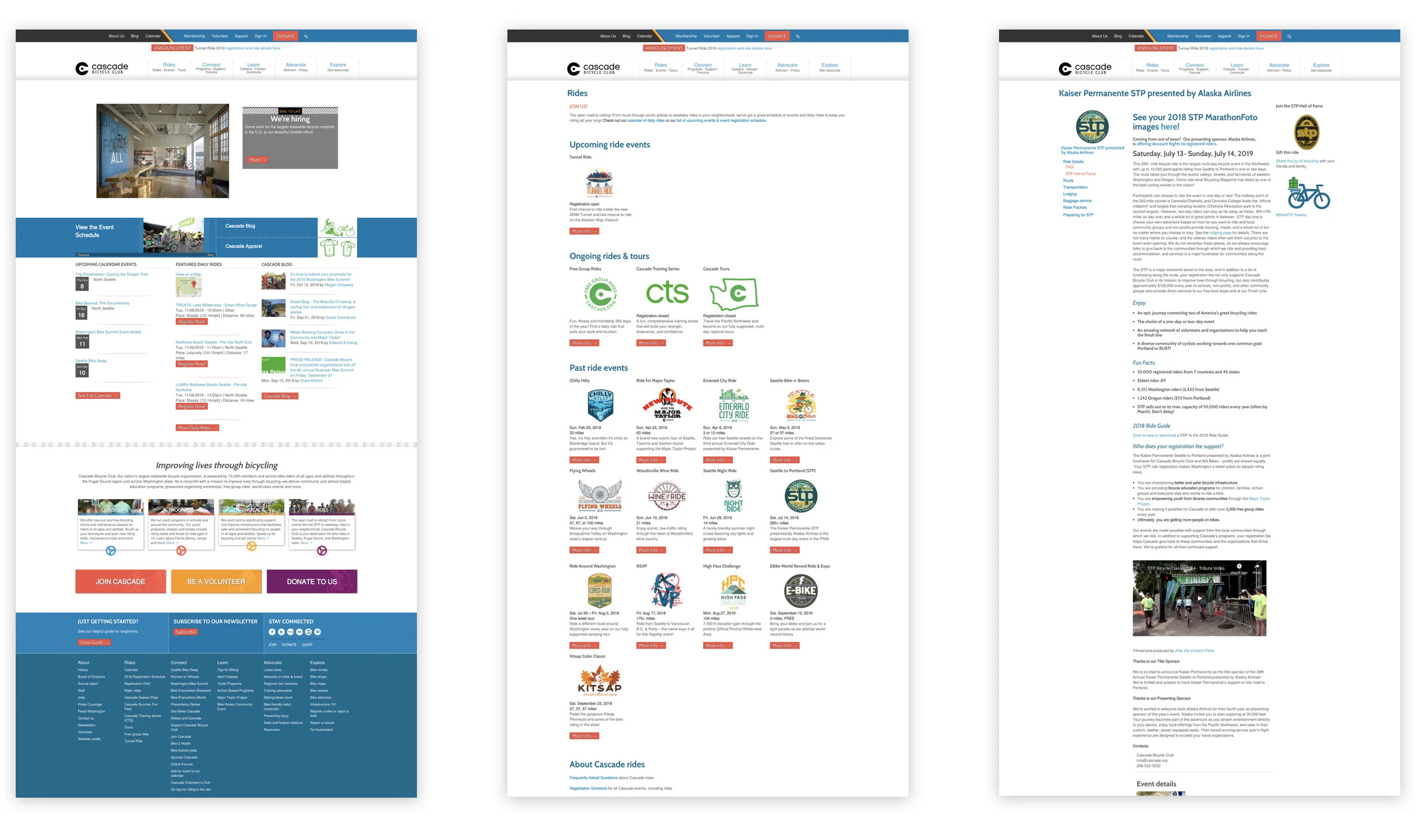
CBC website is the major channel for commuters and bicyclists to find events, register for rides, manage membership status, and stay updated in the biking community.
Currently, It’s cumbersome to navigate, overloaded with content, and lack of visual hierarchy, making it difficult for visitors to browse naturally and have to rely heavily on the organic search. This create a significant barrier in terms of event, membership, volunteer and donation conversion.
Project Goals
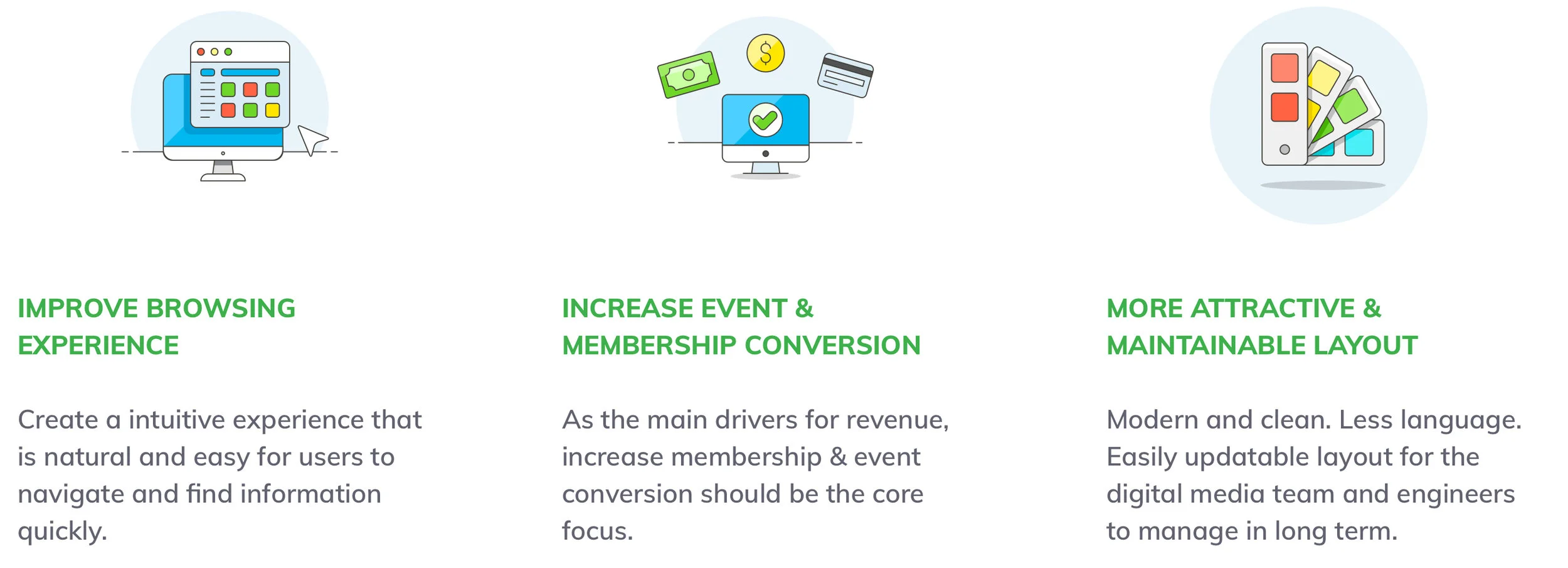
Solution
Features

My Process
01
Empathize
Define Goals with Client
02
Research
Google Analytics
Usability Testing
Card Sorting
Personas
03
Ideate
Competitive Analysis
Information Architecture
Sketching
04
Wireframe
3 Major Scenarios
05
Test
Usability testings
06
Iterate
Interactive Prototype
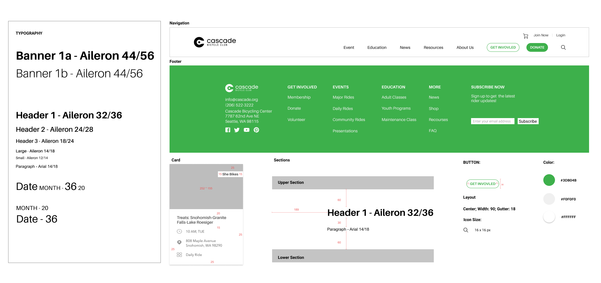
Visual Style Guide
Define Goals
Kicking off the project with stakeholders, we defined the business and branding goals:
Usability: Easy navigation, intuitive and clean
Identity: A website that highlights what they are passionate about without being overwhelming.
Revenue: Always translates information to CTA.
Flexibility: An easily updatable structure for staffs to make changes.
Research
Methods
we evaluated the current website through heuristic evaluation, stakeholder interviews, user testings and Google Analytics data analysis to better understand underlying problems and define scopes.

Google Analytics | Identify Users & Tasks

Heuristic Evaluation | Define Scope

Usability Testing | Define Painpoints
Research Insights
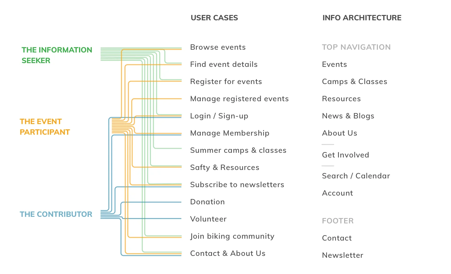
2 PRIMARY USERS & USE CASES
We identified 2 primary users and their needs based on the Top Visit page and demographic data from the Google Analytics,

The Information Seeker
Just started considering biking as a way to commute, these users are new to the biking community and want to explore routes and learn safety instructions on biking in city. They are browsing for a variety of information on the first visit to the website. They need:
Quick overview of CBC
Intuitive navigation to find the right event to start; easily digestable information
A simplified membership flow

The Event Participants
These users are actively engaged in the biking community. They are already members and have ride with CBC before. They use the website to register for rides, get updates and manage membership and upcoming registrations. They need:
Shortcuts to manage membership status and registered events
Rides catelog & rides detail preview
USABILITY ISSUES
insight 1
Confusing IA & Navigation Design
Unclear navigation and information architecture make the users feel lost, and they don’t know where to proceed. Categorization of content is unintuitive and disorganized.
insight 2
Overloaded and Unmanaged Content
The amount of content and excessive CTAs increase user’s cognitive load and makes it challenging for them to consume information and take the next action, such as registering for an event.
insight 3
Taxonomy Issue
Users could not tell the difference between creating an online account vs. becoming a member. Membership program was not communicated clearly to the users.
design recommendations
Optimize For Information Seeking
Reconstruct IA & Navigation
The overall structure needed to be reorganized and simplified in a meaningful way.
Create Consistent Templates
Templates that can reduce both browsing and managing effort.
Visual Hierarchy
Intuitive and refreshing UI design that fits into current branding theme.
Membership Registration Flow
Clear membership introduction to help increase conversion.

Reconstruct IA
Based on the core users and their needs, we reduced the top-level IA items from 13 to 7.
Methods
Card Sorting
Goal: Understand users’ mental model
We did a card sorting section using Optimal Sort to manage the subcategories and pages. We understood better about how users would like to categorize content and how they would like to name each category. Based on the findings from card sorting, we re-arranged Cascade website content, adjust the terminology, and refined the information architecture.
User Tasks Heat Map
Goal: Understand priority
We then created a heat map of user tasks to identify hierarchy of CTAs to appear on navigation bar and landing page.

Takeaways
The less, the better
The Card sorting connected dots for us. Participants grouped
Need an account management hub
Membership is one of the most frequent destination for all 3 users.
Bring contribution to the top
Considering the business aspect, the contribution items(donation & volunteer) should be easily found on the top level.
Prioritize Navigation Categories
Result
Based on user actions, I categorized this initial navigation bar into 2 major sections: information-centered section(Events, Resources, New, etc.) and business-centered section(Membership, Volunteer, and Donation). The new navigation system prioritizes primary user tasks with simplified taxonomy and actionable CTAs.


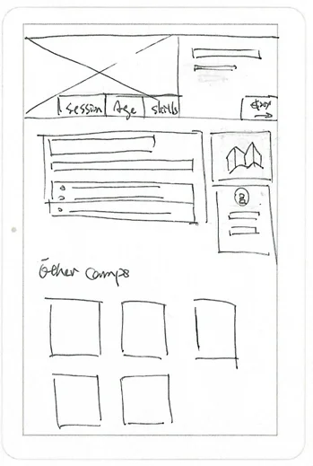
Concept Sketches
We took the newly defined IA and sketched out screens accordingly. I went as broad as possible and sketched multiple variations for each scenarios.
We then critiqued these concepts and narrowed down….
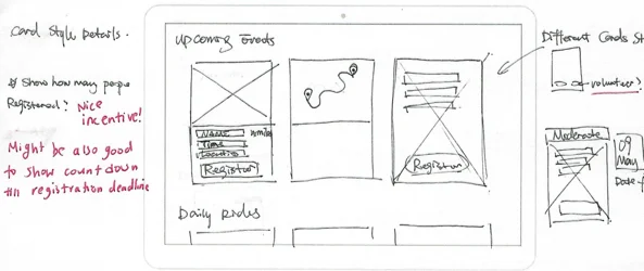
Ideation Highlights
No sub bucket under Events
Users can directly view the event catalog without click into subcategories.
Highly visual-dominated
Route maps and event photos are shown with the same weight as text to improve browsing experience.
Create event summary sections
A summary card that contains primary info and registration CTA is placed on top of event detail page.
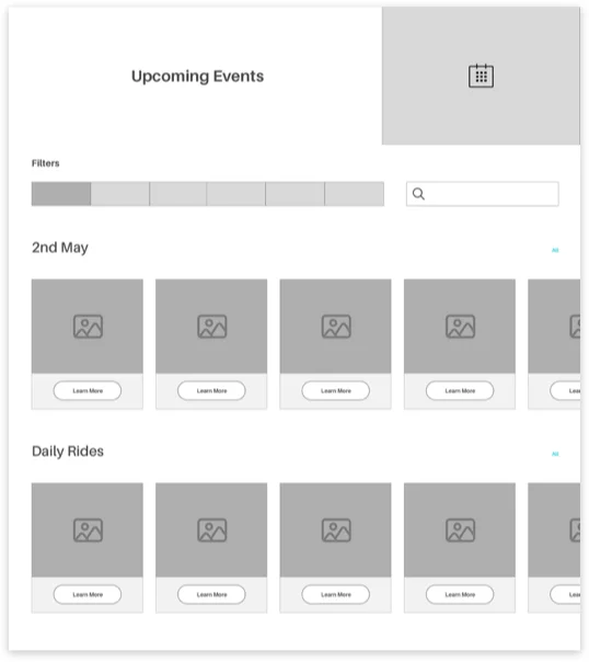
Add multi-functional search bar
A search bar that offers both search and sort function. Users can find events based on time, location, or just names.
Wireframes & Testings
There’re so many stuff to look at. I’m not sure where to start.
We designed around 3 major scenarios(First Visit, Browse and Register, Membership Enroll) and learned following insights through usability testings:
Success
The new IA was intuitive.
Issues
The content and event details layout was still crowded.
Scenario 1
First Visit
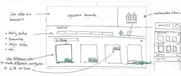
THE LANDING PAGE
Clear hierarchy & selective contents
Preview upcoming events
Image-dominated visual style
Testing Insights
Participants would love to view more events options and even directly filter to interested events on landing page without going deep into event page.

Scenario 2
Browse and Register

THE EVENTS CATALOG
All upcoming events in chronological order. Users can view specific categories using the filter and search functions.
Preview key info: name, date, location, tags, etc.
Switch between card and list views
Testing Insights
The list view is easier to browse and compare than the card view
RIDE DETAIL PAGE
Key info summary + highlighted registration CTA
Tabs that organizes event details into sections
Testing Insights
A more condensed template with only the necessary information. Participants would also want to view all information on the same page.
Scenario 3
Membership Registration

THE REGISTRATION / UPGRADE FLOW
A dedicated hub to introduce users to how to get involved
Interactive benefit table
Testing Insights
Hard to know the difference between creating an account vs. membership
Participants expect to find upgrade feature in profile page
Takeaways
Upcoming Events Preview
Users want to do more with the upcoming events section on the landing page. More details rather than just CTAs.
Card vs. List
Many users preferred the list view over the card when viewing the event catalog. But they also…
Scannable Content
Among all of our users, there was a strong preference for data and content that was scannable.
Visual Hierarchy
The final UI style should be clean and minimal while following the brand’s image.
High-Fidelity Prototype
The Landing Page

The Event Catalog

Event Detail Page