The Play-Later
A cross-platform game discovery experience that allows gamers to explore games through playing.
Overview
This project was initiated based on the shift of EA’s business strategy. Instead of the traditional game purchase model, EA is developing a new experience that allows gamers to own games through a subscription that lowers the entry barrier of playing multiple games.
With this shift, I notice an increasing need for a fast and effortless game discovery service and initiated this feature to fit into the context.
Client
MY ROLE
UX Designer
Research Synthesis(Scope, Persona, Journey, Use Cases, Guerrilla Usability Testing);
Rapid Prototyping(User flows, Wireframes, Hi-fi Prototypes);
Product Management;
Mentored by Jeff Thoene(Manager); Consumer Insights Team
5 Weeks
Project Overview


Browse with a few swipes
A Mobile Hub for Discovery On-The-Go
An intuitive browsing experience designed specifically for mobile devices.


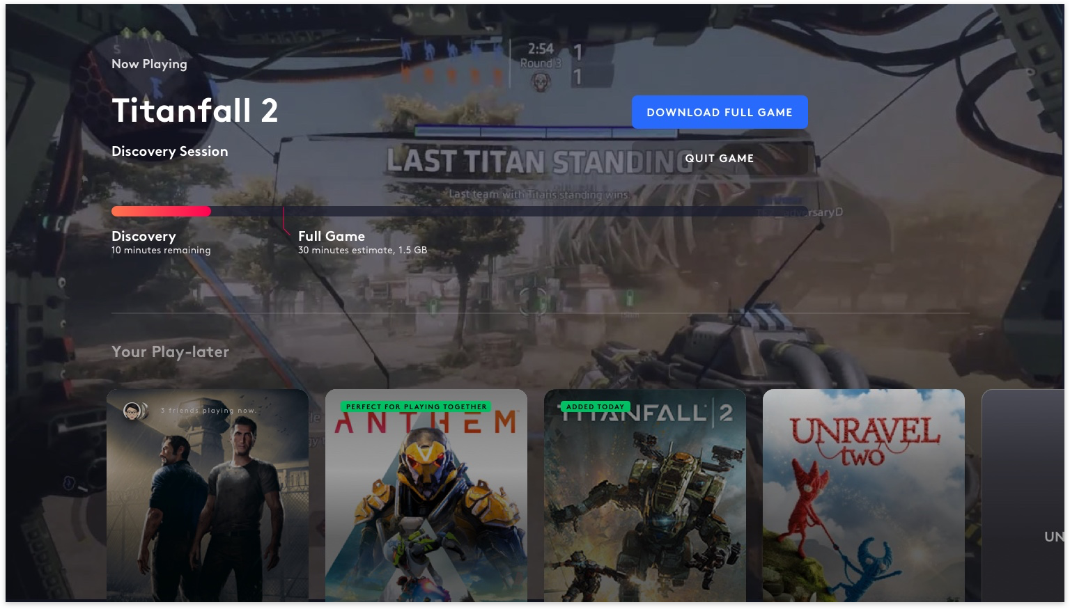
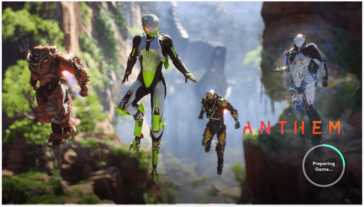
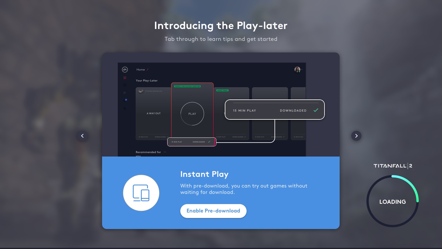
Pre-download demos to devices
Stream games on any of your devices
Pre-download demos of games you are interested in and play them on any of your devices.
Smart back-end management
Only download the games your truly enjoy
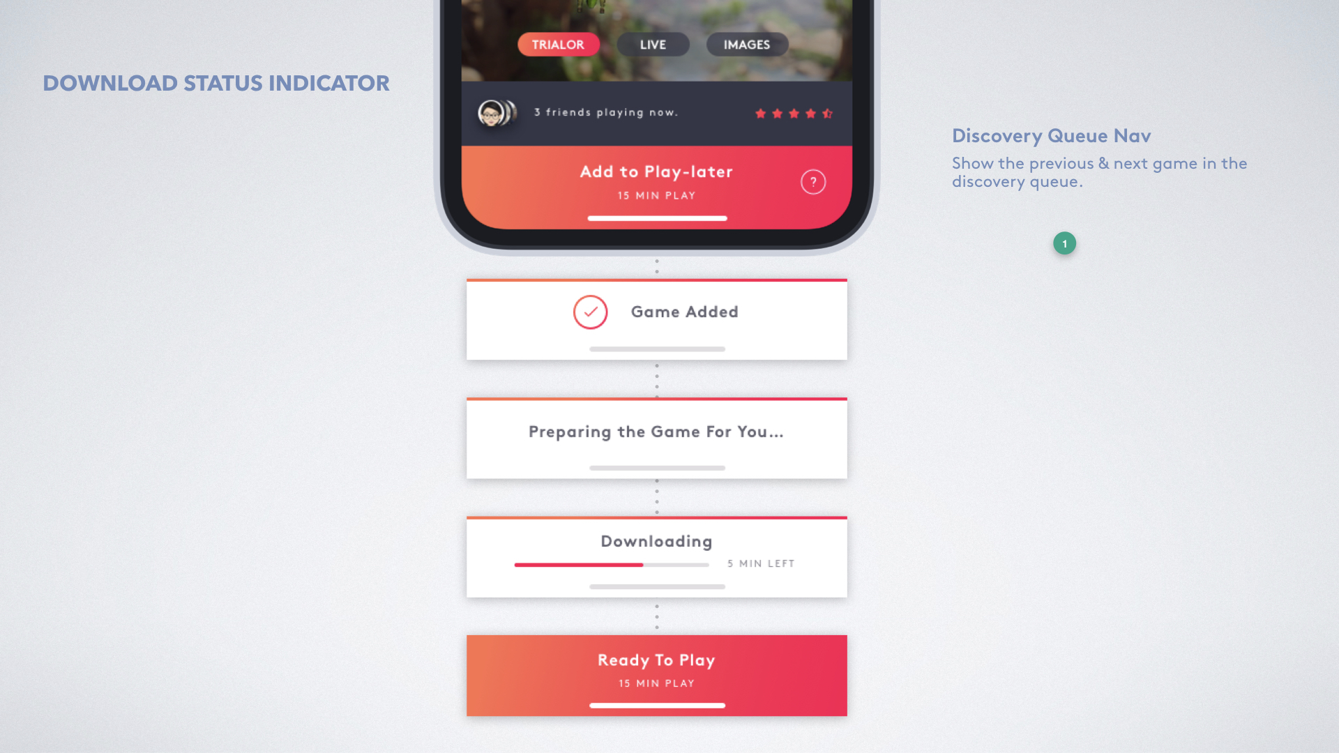
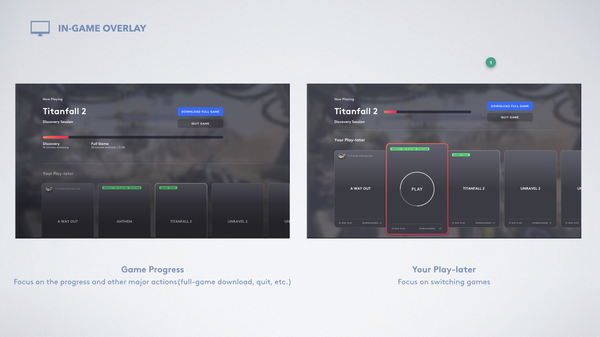
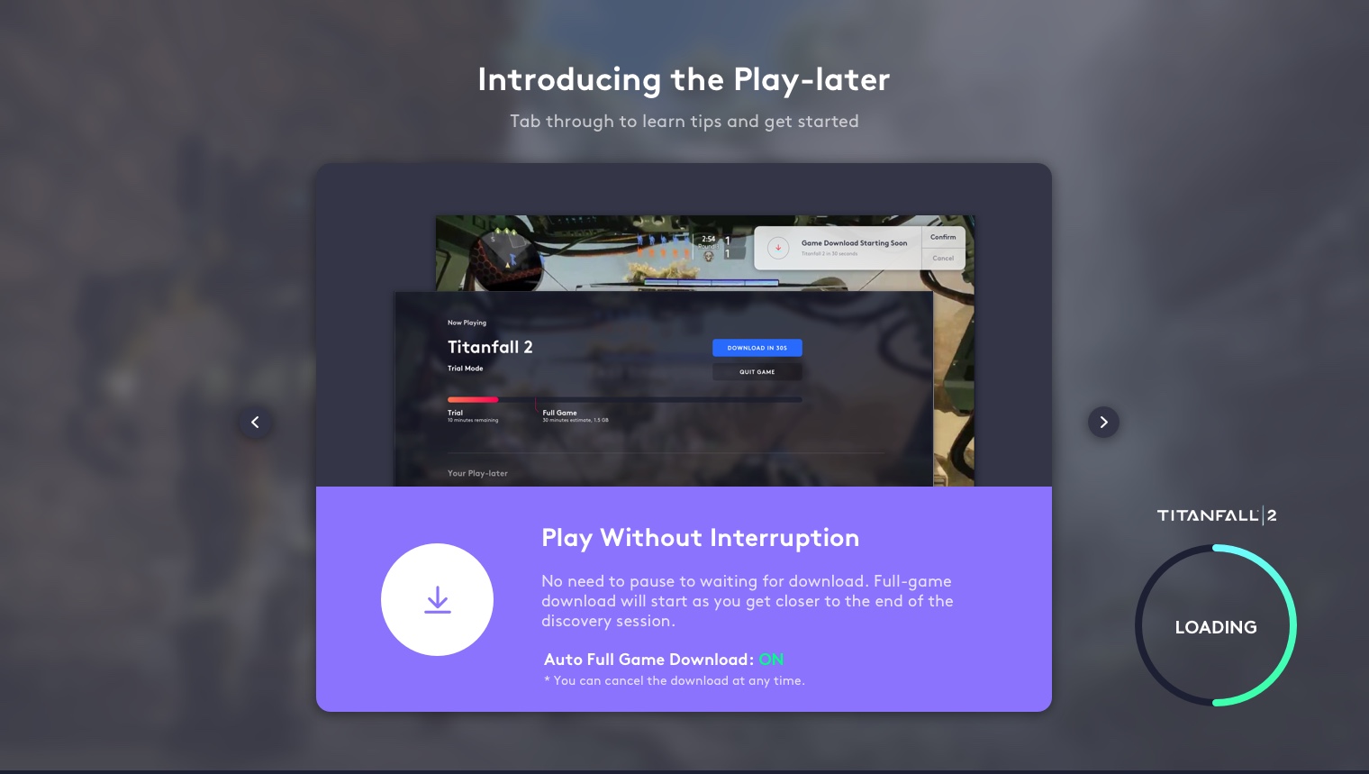
Play without Interruption
No need to pause to waiting for download. Full-game download will start as you get closer to the end of the discovery session.
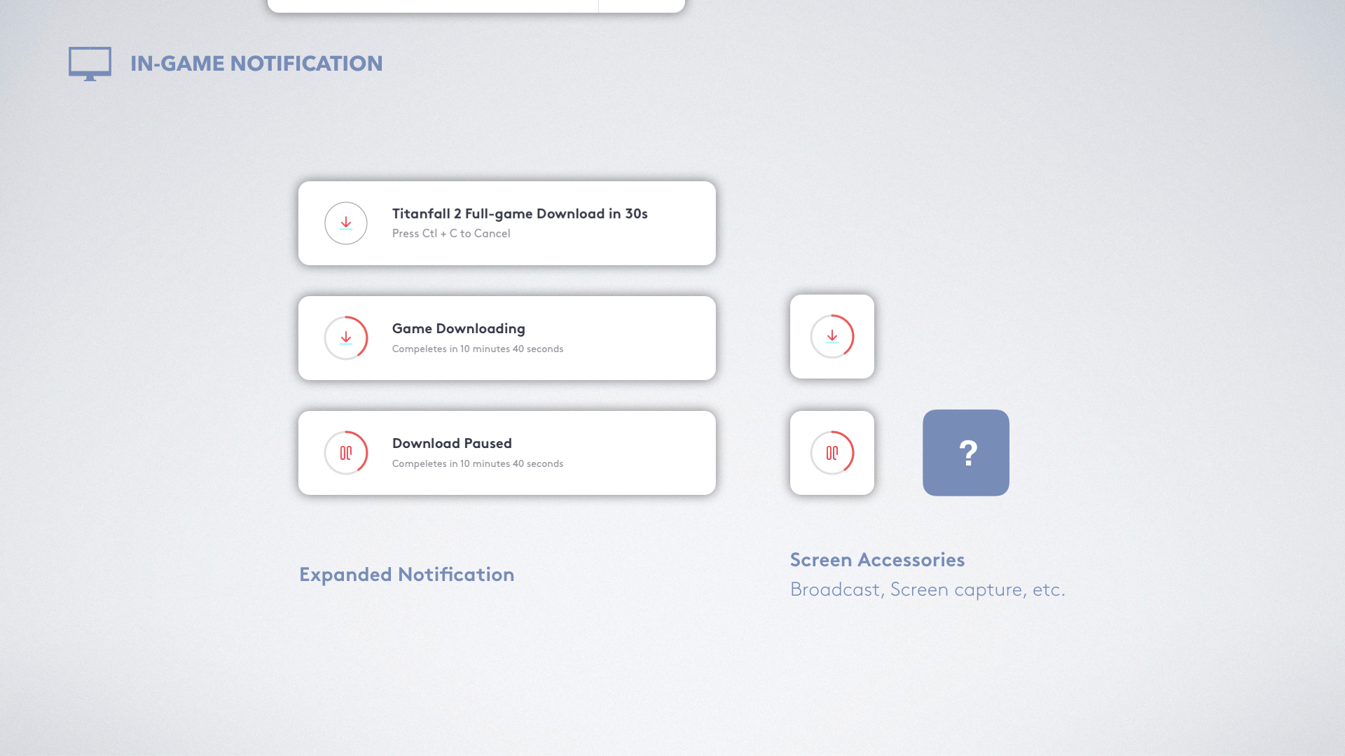
Multiple Feedback Channels
With in-game toasts and accessories, gamers have full flexibility to decide what and when to download games they had fun playing.


Fragmentize your game exploration
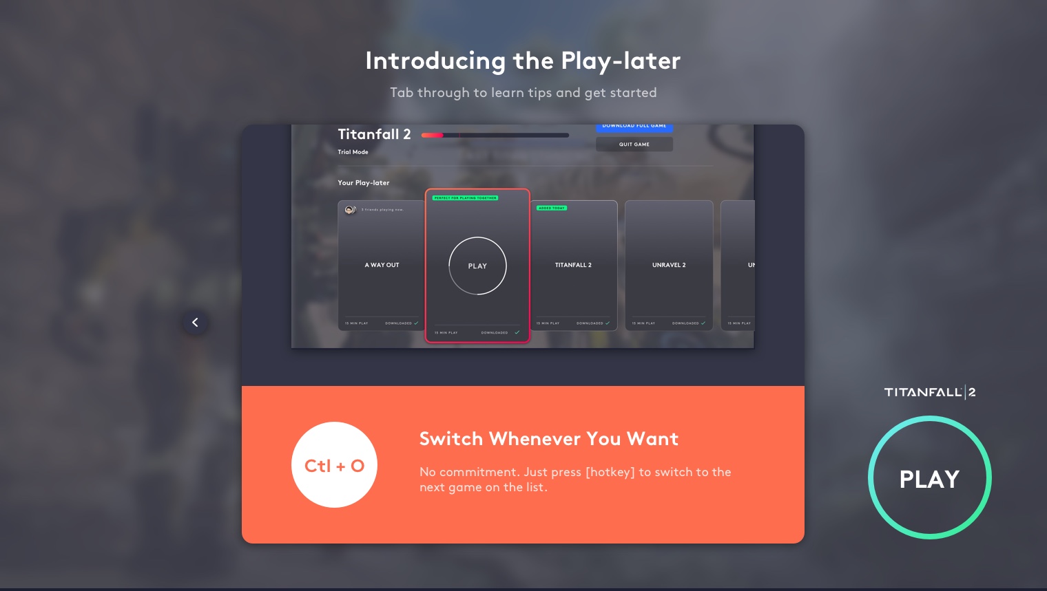
Not Your Game? Just Switch;)
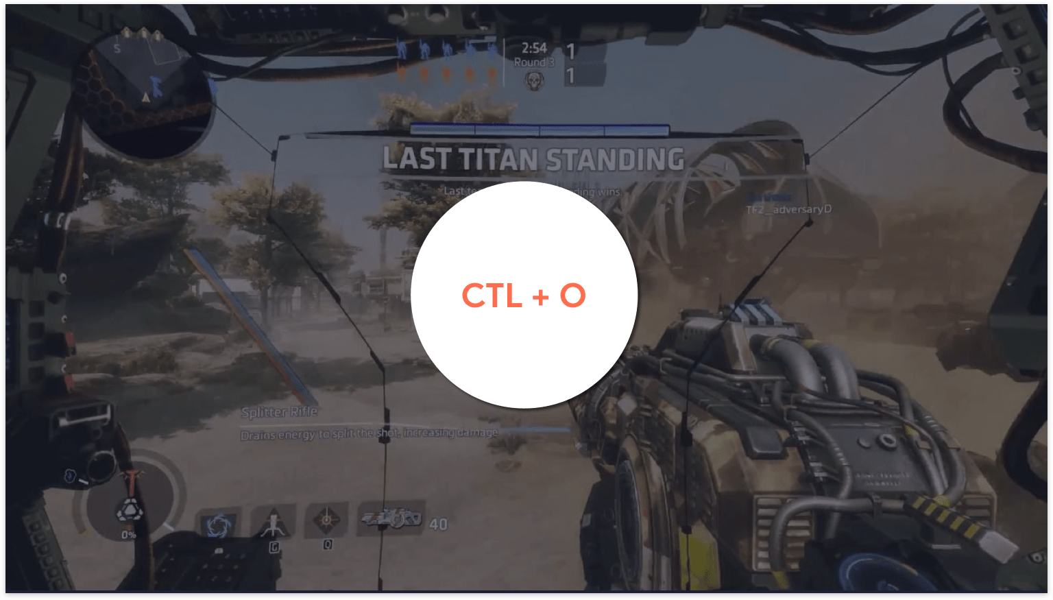
With the In-game Screen Overlay, gamers can switch to other demo without quitting current gameplay.

My Process
week 1
Define
Scope
Problem
Users
week 2
Research & Synthesize
Consumer Insights
Competitive Analysis
User Journey
week 3
Ideate & Evaluate
User Flow
Need-to-feature Map
Sketching
Design Critiques
week 4-5
Design
Wireframes
High-fidelity Prototypes
Design System
Kick-off
Define project scope
Why I chose to focus on improving game discovery experience for subscribers?
I started with a wide open canvas for this project. There was too many potential space to work on, especially when facing different users. Therefore, I initiated meetings with project owners, designers and colleagues from marketing and analytics teams to understand what is needed the most under current conditions.
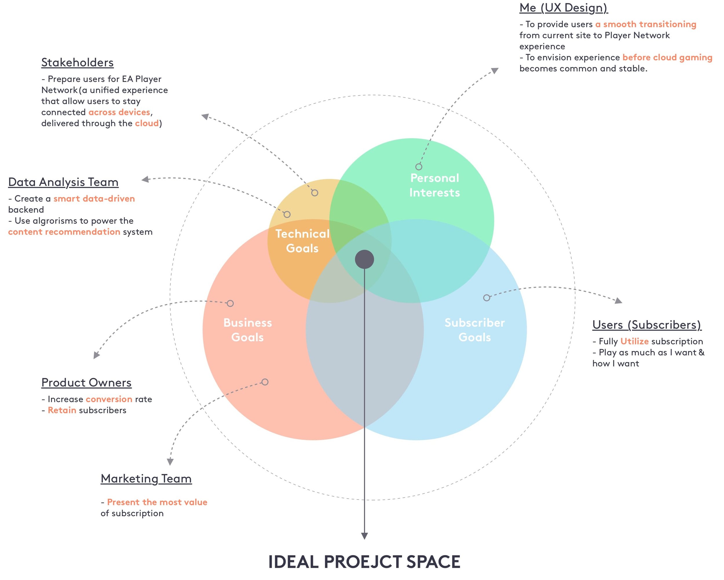
How to help subscribers get the most out of their subscription?
Refine problem statement

A look into the subscription positioning interviews pushed me to dig deeper into the core of this problem.
Based on the research, I was surprised that gamers don’t need another game recommendation feature since they are already using platforms like Reddit and Twitch. Rather, they are struggling in find the “right” game. Moreover, with a lot of conflicting priorities, it’s hard to dedicate the time for gaming.
I realized that helping gamers find “worthwhile” quickly is the key.
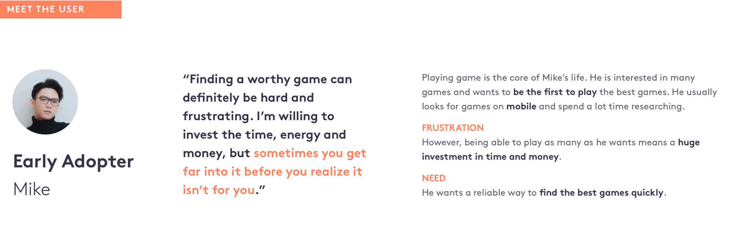
User Quote
“Finding a worthy game can definitely be hard and frustrating. I’m willing to invest the time, energy and money, but sometimes you get far into it before you realize it isn’t for you.”
- Catalog player, Dallas
Define Users
Design for Breath, not Depth
For different gamers, “worthwhile” means very different things. As I dig deeper into user’s needs, I found that it could 2 very different products depending on the different gaming habits. I decided to focus mainly on the Catalog players according to the project scope defined in the early stage.
DEPTH: FRONTLINE PLAYERS
Time/Money Equation
Primary hobby; allocate significant time/money
Behaviors
Focus on 2-3 big titles;
On top of the community;
Being Professional
BREATH: CATALOG PLAYERS
Time/Money Equation
Limited time or money; want best possible within constraints
Behaviors
Play as much as they want;
Have fun with friends;
Want to make use of the full subscription value
Concept Comparison: Initially, I explored many different ideas to cover both players. However, designing for both would expand the project scope. Through talking to team members, I narrowed down to only focus on the catalog players.

More difficult to implement
Not necessarily relating to subscription
Only valuable for frontline gamers
Easier to achieve
More related to the core value of subscription
Valuable for broader range of gamers
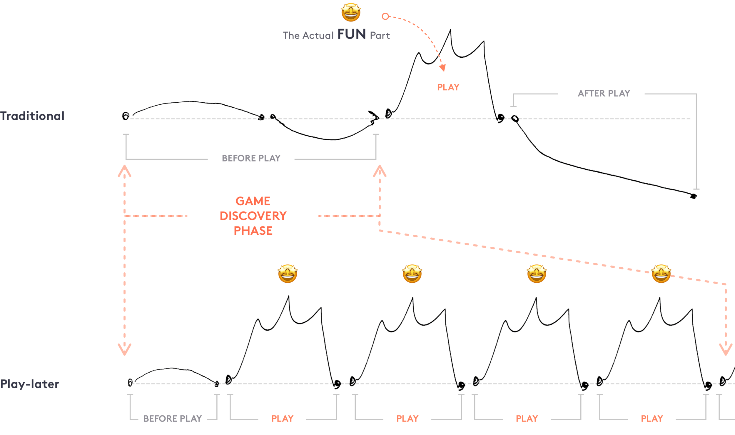
journey mapping
But what does it even mean when users say they want to spend more time gaming?
*Business-wise: How to keep subscribers engaged in consuming game content?
I mapped out the current game exploration journey and visualized user emotions to find out painpoints behind this frustration.
Current User Journey
Painpoints Illustration


Ideate, critique, & repeat


translate insights to features
How I organized ideas into actionable features within limited time
Designing for the whole discovery flow was a huge scope to dig into. To clear my mind and keep focusing on the core experience, I mapped out user goals, problem statements and user tasks, and align them to actionable features and entry points.
This map helped me to understand the scope of the project as well as the priority of feature needed in terms of communicating my vision. I was able to quickly decide on the key user flows.
The needs-to-feature document
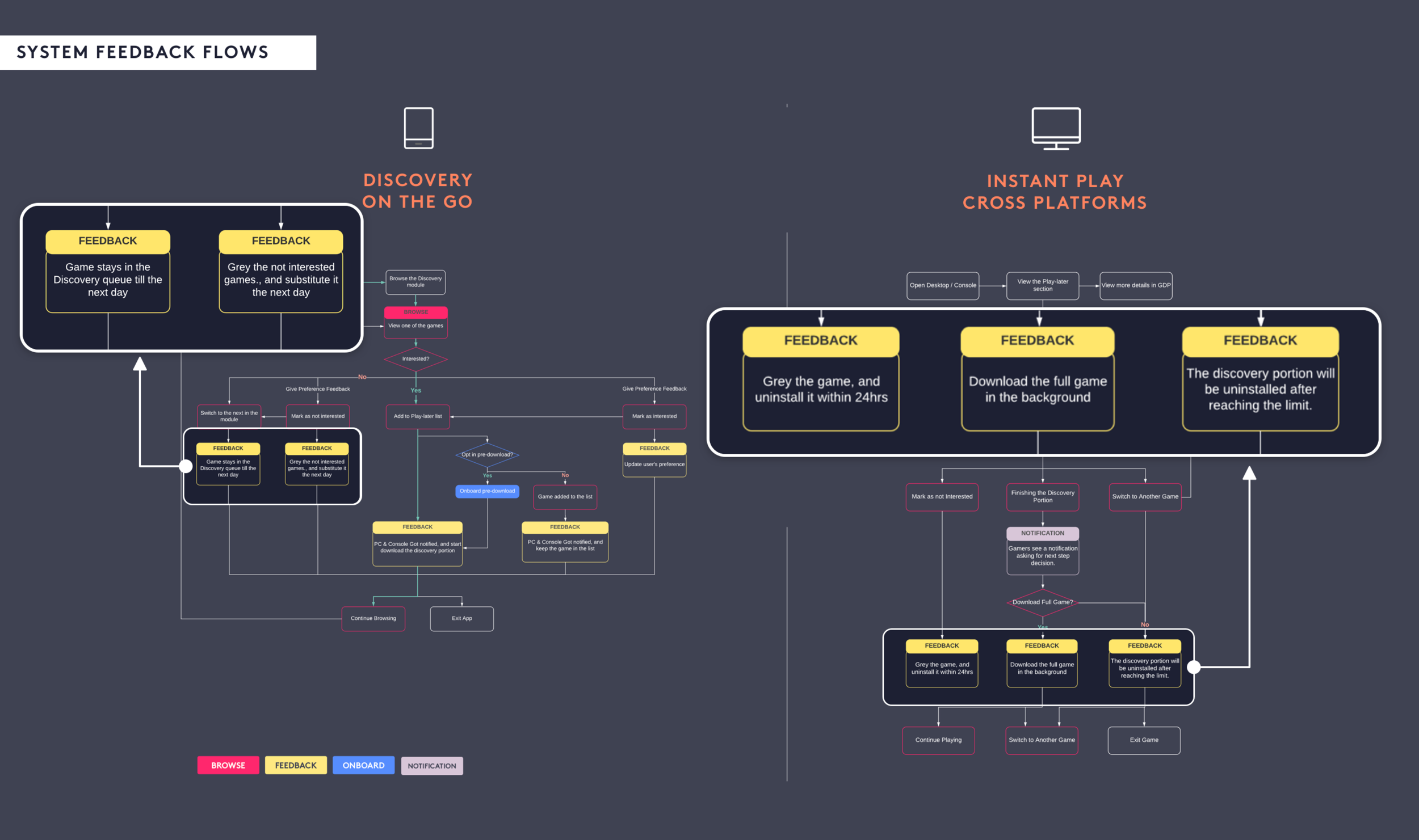
Design Across Platforms
Mobile to Desktop
Based on persona behaviors and user flow, I decided to create a cross-platform design for this concept. I analyzed tasks needed for each platform and sketched out my visions accordingly.
User Flow & Tasks

Concluded from my insight-translation map, I found the device touch point pattern and connected them into the flow chart above. Based on these user behaviors, I visualized my ideas through sketches and prototypes.
MOBILE: Browse Scenario

DESKTOP: Review, Play, and Switch

Design for Trust
The Challenge
“I am hesitated to opt-in pre-download before I know how it works. I don’t want to have a bunch of random stuffs downloaded on my devices.”
In order to maximize the benefit of the Play-later, pre-download plays an essential role in the whole experience. However, allowing automated pre-download function requires a lot of trust of the system.
Investigate
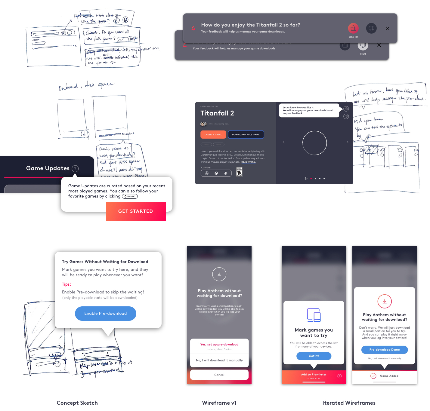
I quickly created a set of storyboards and wireframes to visualize the concept and gorilla tested with colleagues across teams. And below are some issues I found:

Concerns
From the frequently asked questions, I summarized 2 major concerns.
Concern 1
What should I expect after I clicked “Enable“?
Users were lack of background information of the new feature and were expecting to see a thorough introduction before using it. This indicated that an onboarding flow is critical for NUX in terms of lowering the entry barrier as well as creating a trust-worthy impression.
Concern 2
Would it “run wild” after I opted-in? How can I control this automated feature?
I also noticed a fear of losing control over the downloaded library. Users were looking for a balance between automated and manual download management. Thus, my design should leave enough space for users to give feedbacks, make changes and take over the control when necessary.
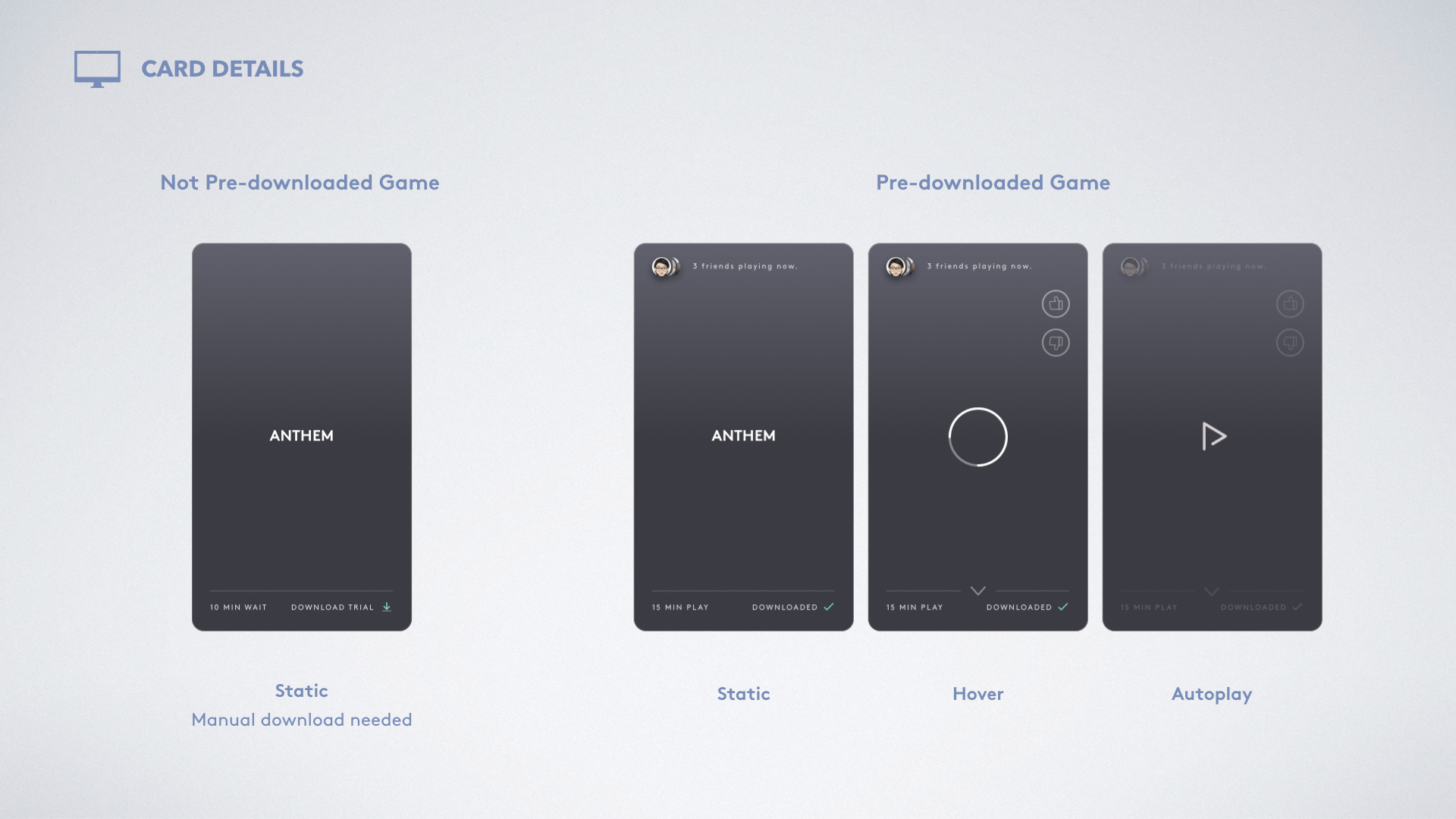
Solutions
The solution consists of 2 parts: 1. onboarding experience; 2. back-end feedback system.
Solution pt 1
Double Onboarding Flows
With all the complications in enable automated downloads, it's our responsibility to give users the right guidance they need and build up their confidence.
I designed and tested a variety of onboarding flows, and modified prototypes according to feedbacks. After rounds of iterations, I finalized the onboarding flow into 2 parts: 1) onboard mobile pre-download; and 2) onboard gameplay manage & switch tips.

Onboard gameplay manage & switch tips:
Solution Part 2
Provide Ways to Say “No” (preference + back-end control)

Measure the result
Working with the style guide
Challenge
It was my first time incorporating a style guide that contains more than hundreds of symbols, colors, grid systems and typography. With such a large library, it is easy to get lost and stumble on picking the “right” visual elements for hours and hours. Working on this adventurous project using EA’s newest design system was even more complicated and full of possibilities. On the fun side, it left me plenty space to be creative and craft new components beyond the existing library.
Solution
After I consulted with the senior designer, I started with just a few fundamental libraries: typography, grid systems, colors, iconography, buttons and inputs. I went through them and picked out the components that were the closest to what I need and started to build upon them throughout wire-framing and prototyping. For the components that were brand new to the existing guide, such as the mobile card navigation and the in-game overlay, I made the visual connections by using consistent spacing, color, and corner radius, etc.
RESULT
By applying the visual guidelines early in the design process, I got to weave the new design language into my design step by step and created a set of implementation-ready hi-fi within the tight timeline.
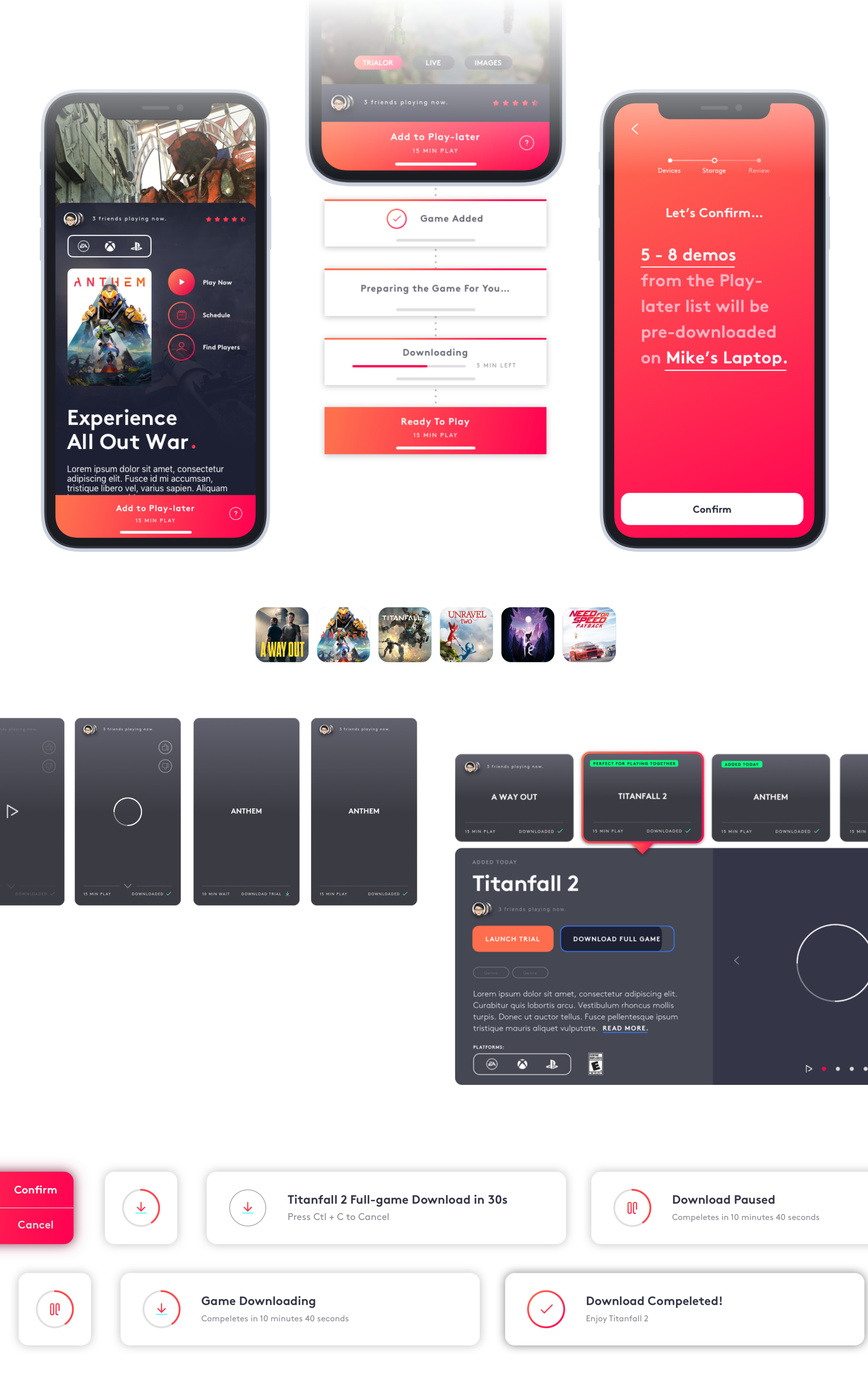
Design Gallery