
Overview
In this 3-day design exercise, I was challenged to redesign a IoT App that will provide and communicate the simplest and most efficient way for users to interact with when changing applicable settings for each device.
Presented with a set of problematic initial wireframes, I was tasked to 1) solves current usability flaws 2) as well as turning it into something aesthetically beautiful.
The main challenge for this exercise was to interpret and reverse the intentional ambiguous problem, and to showcase my approach remotely.
Client

Finger Food creates industry transforming solutions for global companies at the convergence of AR/VR, AI, Robotics, and IoT. Their partnership includes Microsoft, KPMG, Sphero, Activision, Cirque du Soleil, Lowe’s, Lululemon, and many more.
My Role
UX & UI Designer
Problem Synthesize, Information Architecture, User Flows, Wireframes, Higher-fidelity Mockups, Presentation Deck
3-Day Design Challenge
The Initial Wireframes & My Questions
Wireframes overloaded with options
Redundant IA
Problem
The current information architecture is poorly organized, which makes the app cumbersome to navigate and leads users to perform repetitive setup steps.
Goals
Solution
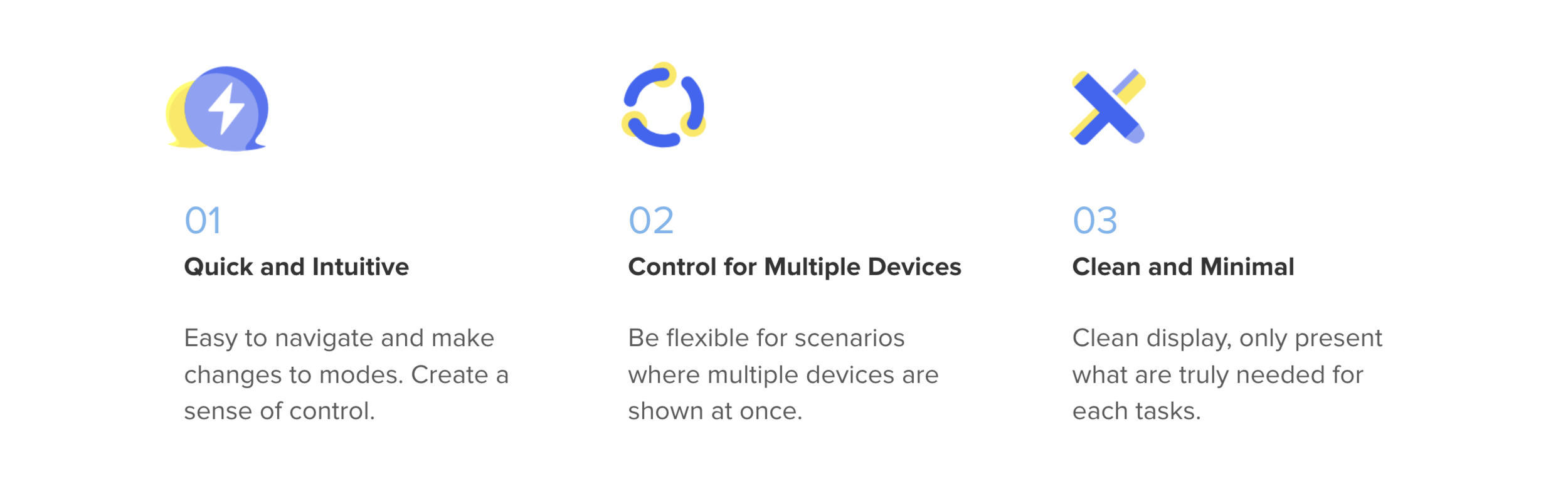
Less effort to make home more smart.
Scenarios-Based Display
Tag Devices
Simplified Setup Logic
I want to offer an intuitive experience for user to take control of their home environment. A platform where they can easily set up, integrate, and program variety of smart home devices.

Challenges
Design with Ambiguity
Similar to what we may encounter in real life, the project was assign without further information on the problem, users, or their needs. But with one ultimate goal: To design the best user experience possible.
Planning and Priority
With only 3 days—roughly 8 hours, I had to plan ahead to make sure delivering a design that meets the client’s core needs: beautiful and useful.
Present Thinking Remotely
Since the design will be viewed remotely without my presence, it is important to create an intriguing story to pitch the concept, and more importantly, to demonstrate my thinking process and skills.
My Process
Day 1
Synthesize & Scope
Heuristic Evaluation
Persona
Day 2
Sketch & Ideate
New IA
2 User Flows
Wireframes
Day 3
Visual Twists
Higher-fidelity Mockups
Visual Designs
* Above are how I white-boarded and synthesized information
Day 1: Synthesize & Scope
Heuristic Evaluation
Dealing with Ambiguity
ME: On the 3rd screen, what does the “Metadata” means? And what does the “Enable Temperature” do?
REPLY: Who knows?! ;)
When I first got the challenge, I was confused by the assigned wireframes as there was no information regarding the target users, their needs, use cases, or explanation of current features.
Takeaway
Who’s the User & What’s Needed
I interpreted the initial wireframes and developed assumptions around the end user. Based on the assumptions, I created a persona who needs shortcuts to manage multiple devices on a daily basis.
A busy housewife who is trying to set up smart home routines to make her daily life easier.
Persona
Alison’s Story

Restructure the Information Architecture
As a IoT novice, she just wants to quickly create shortcuts that help her control appliances scattered in the house, while allows overwrite when needed.
Based on the user story, I concluded two core use cases for this App: The Remote Control, and The Shortcuts. Following Alison’s biggest frustration and the client’s request, I focused on designing the experience for using shortcuts(modes).
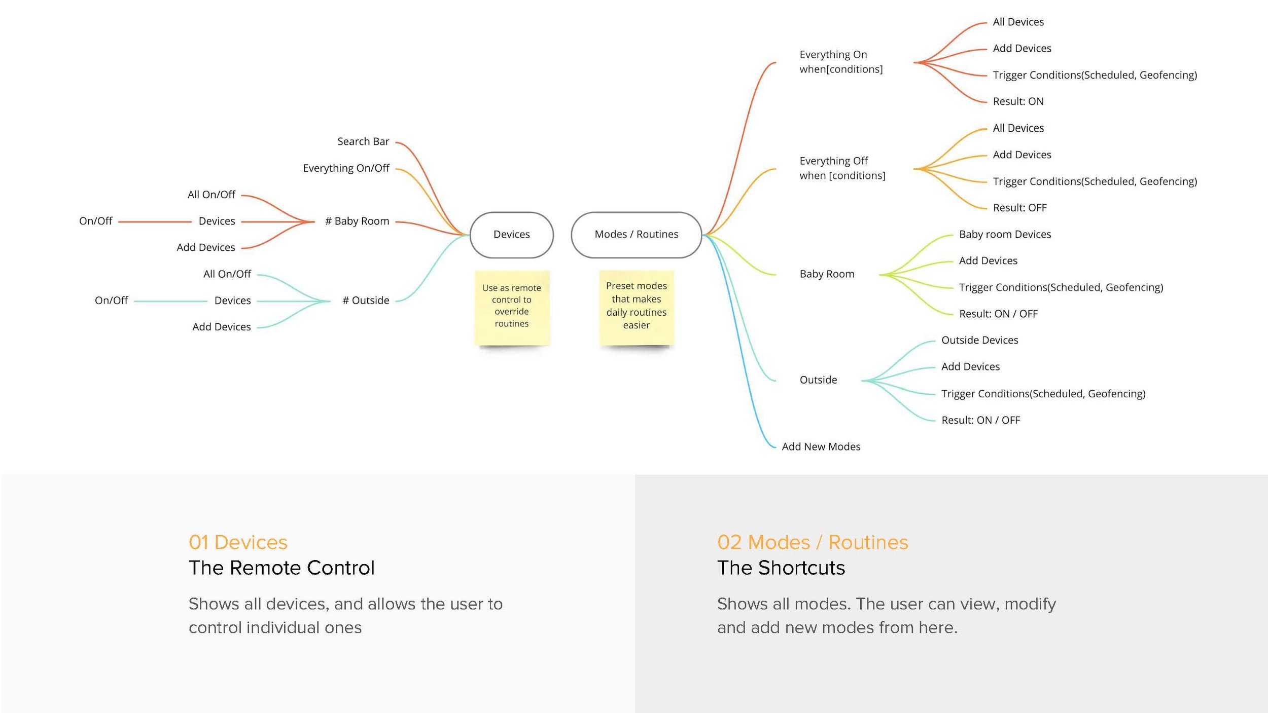
The Overall Information Architecture
With this new IA, I wanted to:
Create a clear hierarchy between the Smart Event and Its Conditions
The “Scheduled” and “Geofencing” modes are moved under other modes, since they are just trigger conditions.
Set Up Memorable Scenes
Instead of categorize modes using areas(like Baby room and Outside), I named them by scenarios to make it more intuitive and memorable.

Day 2: Sketch & Ideate

2 Use Scenarios
Having settled my user persona, her needs, and iterated IA, I set forth to design 2 journeys for Alison who already set up a couple modes to modify existing modes and to create new modes. Once the flows were set, I sketched out my thoughts to get feedback and created wireframes base on them.
Scenario 01
Change Existing Modes
The Story: Alison wants to reschedule baby room lights to turn off after 8:30pm.


Scenario 02
Create A New Mode
The Story: Alison wants to add a “Coming Home” mode which will turn on living room TV when she’s close to the house.


Design Variations
One of the biggest consideration for my design is to minimize the user’s learning curve and help her accomplish tasks with the least steps needed. Therefore, it is important to create an intuitive home screen that communicates a clear hierarchy.
Decision 01
A Home Screen that Facilitates Actions


Decision 02
Tags that Assist Device Selection and Management

Day 3: Visual Twist
On the 3rd day, I finished the final design and unified visual elements, including UI components, Colors, Typography, and Icons.
UI & Interaction

Color Scheme

Typography

Reflection
If I were to have more time, I would:
Test user flows to further simplify steps needed.
Test usability of tags and create constraints based on users’ habits.
Explore more family-friendly features
Create a full set of UI system
Learnings:
Always Keep An Eye On References
Form a habit of saving and updating useful and delightful designs. It will be handful when needing to create a beautiful UI in limited time.
Prioritize
Less is more. First, reach the minimum requirements and craft a clear story to convince stakeholders. Then, twist the visual, adjust the radius, and pick the “right” gradients ;)